When it comes to marketing materials and advertising campaigns there’s a lot of credence given to just how ‘attention grabbing’ the work is. The more likely it is to make you stop and look, think or do, the more successful it is. This makes total sense in theory. Finding that perfect message that cuts through the noise like some kind of laser-guided marketing missile can transform a business.
But ‘attention grabbing’ doesn’t always equate with ‘effective’, in some cases it can mean the exact opposite. We’d argue that not everything that’s unavoidably noticeable is necessarily a good thing. After all, even with huge strategy teams, brand workshops, creatives working day and night to find a concept that’s going to ‘work’ – if the final piece feels like it’s trying too hard, well, that’s bad news for the campaign and the brand.
A good example of this from recent memory might be Burger King’s ill-fated ‘The King’ campaign which ran in the mid/late naughties. In these ads, the fast food chain’s long-reigning mascot was reimagined as a (sort of) real life king, complete with staff, robes and an oversized plastic head that was fixed in a permanent grin. In action, the King was even creepier than this description sounds: sneaking into the beds of unsuspecting customers and appearing ‘Halloween’ style outside their windows amongst other slightly deranged scenarios. In short, this campaign just didn’t land. It felt too earnest and instead of converting sales all it seemed to do was leave people slightly freaked out and possibly wondering if their double-whopper and coke had been spiked.
OK, that might be a particularly good example from a global brand that’s generally on-point with their marketing – what about the flip side? Those well-crafted pieces of advertising and branding that somehow seems to just grab your attention and hold it, sometimes even long after it’s out of sight. No cheap tricks, no gimmicky zeitgeist-dropping, no freakishly oversized plastic masks in sight.
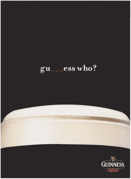
Take this press ad from Guinness for example. You could count the colours it uses on one hand. It’s an arrestingly stark, and deceptively image that tells you a lot more about the brand and the product than might be apparent at first. Bold, confident, premium, a sense of heritage, unique… all in one very simple image with two (or one and a half words). It’s the very definition of ‘less is more’.

In terms of promotional merchandise that we admire in a similar sense is this piece from dog food manufacturer, Iams. Here they’ve boiled their message down to one simple, clear-cut proposition: feed your dog Iams and it’ll become strong and healthy. This ‘10kg’ frisbee is a great way of illustrating this point and pitches it with a sense of humour that doesn’t go overboard or feel like it’s desperately vying to go ‘viral’. There’s also the added bonus in that it’s a fun, useable product for dog users that deepens their positive associations with the brand.
It just goes to show, anyone with a marketing budget can get attention – it’s how you go about getting it and what you do once you have it that really makes the difference.
Looking for inspirational promotional merchandise ideas to gain some attention? Talk to our experts today.